ADQUIO ANALYTICS · USE CASES
Higher consumption can mean more production, an idle machine or an auxiliary service that needs attention. Industrial context changes the interpretation.
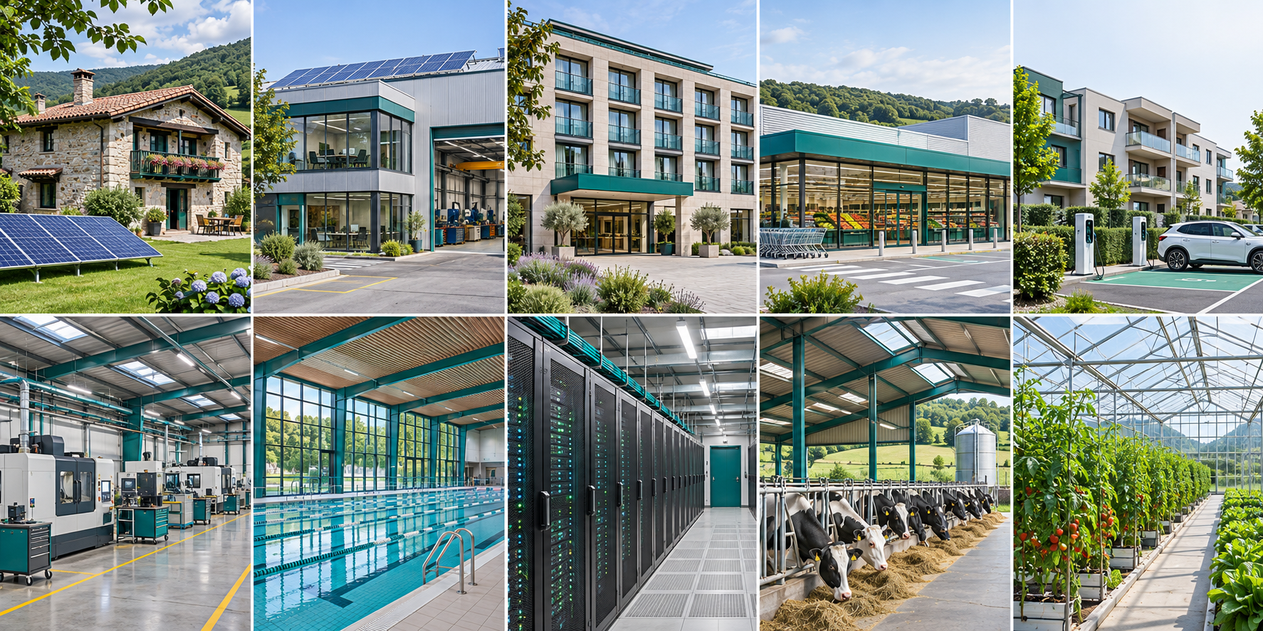
This article presents a use case with simulated data. The main image is a generated illustration; the screenshots show the Adquio Analytics interface.
The scenario: Solar Factory
The example represents a 3,500 m² factory with 48 employees, three production lines, eight CNC machines and twelve assembly stations. Compressed air and extraction add to the shift’s technical loads.
Dashboards relate energy to productive activity. Viewing production, OEE and auxiliary services together supports better questions than simply comparing the kilowatt-hours of two days.
Questions this example helps answer
Visualisations become useful when they support a specific decision. This example helps explore the following questions:
Does demand coincide with the production shift?
How do OEE and the model’s reject rate behave?
Which auxiliary loads remain during breaks?
Technical reference for the example
These values define the reference scenario. They are simulation parameters, not a specification for a verified customer installation.
| Parameter | Model reference |
|---|---|
| Reference floor area | 3500 m² |
| Team | 48 people |
| Photovoltaics | 200 × 400 W modules = 80 kWp |
| Inverters | 3 × 30 kW |
| Nominal battery capacity | 200 kWh |
| Nominal storage voltage | 51.2 V |
| State-of-charge window | 20–90% |
| Storage efficiency | 96% in each direction |
| Simulator update interval | 60 seconds |
| Weather update interval | 60 minutes |
| Production | 3 lines · 90 units/hour · target 720 units per shift |
| Machining | 8 × 7.5 kW CNC machines |
| Assembly | 12 assembly stations |
| Compressed air | 2 × 11 kW compressors · 7.5 bar |
| Extraction | 3 × 1.8 kW units |
| Shift and break | 07:00–15:00 · coffee 10:30–10:45 |
| Reference reject rate | 2.2% in the model |
The dashboards, explained
Each view answers a different question. Select a thumbnail to open a large image; use the viewer to move to the next dashboard or switch to full screen.

Energy overview
Relate generation, demand, grid import and storage throughout the simulated production day.
How to read it. Look at energy alongside the shift and the production context.

Production and OEE
Compare production rate with availability, performance, quality and overall equipment effectiveness.
How to read it. Separate producing more, operating longer and producing fewer rejects; the OEE belongs to a model.

Compressed air and machinery
Inspect compressed air pressure, compressor temperature and CNC vibration alongside selected power readings.
How to read it. Use patterns to prioritise investigation; diagnosing leaks or equipment faults requires appropriate measurements.
These views were prepared in an isolated Analytics instance by running the supplied simulator. No connections or writes to real equipment were made. They are not recorded historical data from an installation.
From example to your installation
The same approach can be adapted to the variables and equipment available in your project. Start with the decision to support, then choose the appropriate measurements, units, periods and visualisations.
DataSource collects and prepares the data, and Adquio Analytics presents it in dashboards. Review measurement coverage and keep the same boundary when comparing days, areas or equipment.
The screenshots illustrate analytical possibilities. They do not verify savings, operational results or automatic control of equipment in this example.
What do you need to understand about your installation?
Tell us what you want to measure, compare or present, and we will help define a useful view for your team.